Fantastic Voyage- annotations
Some feedback that I got from the pitch was to improve the annotations that appear on screen during my animation. It was suggested that I should use a different font and to think about how the annotation appear on screen.
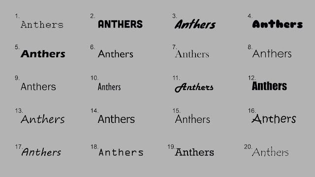
I selected a variety of different fonts:
I decided on number 17 because it is simple and easy to read but also more interesting than the original font that I had used in my animatic.
Also to put more emphasis on the annotations when they appear and to make them more exciting to the audience a short sound will play every time an annotation appears.
Here I implemented these changes into one of the annotation sections in my animatic:


a suggestion - can you source a range of slightly different 'pop' sounds - maybe 3 - so you can lend a bit of additional interest to your 'popping' idea - otherwise it could feel a bit tiresome if there's lots of them - it's a small variance, but I think it will keep things pacier.
ReplyDelete