
@Phil Fantastic Voyage- New thumbnails after OGR
After feedback from my OGR I tried out what was suggested with using paint and collaging paper together:

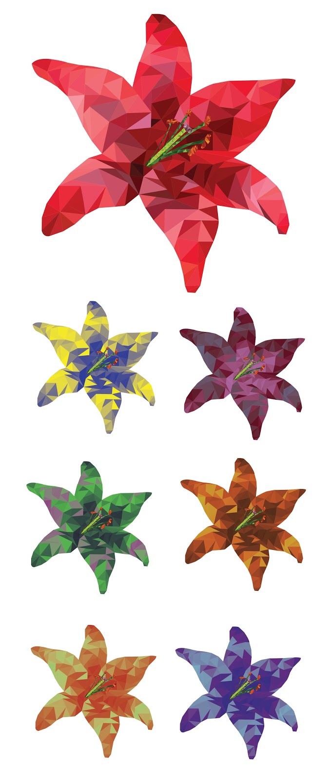
I also talked to Simon and he gave me a good suggestion of a technique I could try out, which was to 'colour in' a flower shape by making it look low resolution:
 (The top flower is the one I did in illustrator and then the bottom ones had gradient maps put on them once I had brought it into photoshop so that I could try out different colours)
I do really like how these thumbnails have turned out, especially the 'low resolution' ones and I'm thinking about how I could go about creating some more thumbnails showing more of the 'whole world' in this style.
I also talked to Simon and he gave me a good suggestion of a technique I could try out, which was to 'colour in' a flower shape by making it look low resolution:
I do really like how these thumbnails have turned out, especially the 'low resolution' ones and I'm thinking about how I could go about creating some more thumbnails showing more of the 'whole world' in this style.
Hey Em - I like the collage ones actually - I think they have that 'low-poly' quality in terms of their shapes - those squared edges etc - I think you should push this further - but in terms of the petals etc - can I suggest you trying working up some more 'open' textures and also using a greater tonal range of colour - so instead of that purple lily being made up of lots of the same purple texture, make a series of purple textures from lighter to darker, and the build from that set - it will help make the shapes seem more distinct and less 'blobby'... for an example of this technique being used by someone else, take a look at this artist's work...
ReplyDeletehttp://phil-cooper.com/collage/
Hi Phil, I'm not quite sure what you mean here, are you referring to the first or second set of thumbnails? I was thinking about maybe incorporating some of the textures from the first set of thumbnails into the patterns of the second set of thumbnails
ReplyDelete