Hi Em - sorry, I missed these first time around. I like 4 because the more faded palette is making the image easier to read and the colours are very satisfying and I like 11 compositionally; with this technique you need to guard against the 'overall effect' of all those textures making it difficult to prioritise what to look at. Composition is REALLY important in terms of staging your shots and I'd explore how 'depth of field' might help you organise the picture plane - i.e. when everything is in focus, everything becomes difficult to separate, but if the stuff further away was more out of focus, we could be directed to look at particular bits of the composition more obviously. I think you're onto something - but you need to control it very purposefully :)


Hi Em - sorry, I missed these first time around. I like 4 because the more faded palette is making the image easier to read and the colours are very satisfying and I like 11 compositionally; with this technique you need to guard against the 'overall effect' of all those textures making it difficult to prioritise what to look at. Composition is REALLY important in terms of staging your shots and I'd explore how 'depth of field' might help you organise the picture plane - i.e. when everything is in focus, everything becomes difficult to separate, but if the stuff further away was more out of focus, we could be directed to look at particular bits of the composition more obviously. I think you're onto something - but you need to control it very purposefully :)
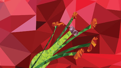
ReplyDeleteI felt I should comment on this post because this style seems to be really appealing to me. I like it a lot. I feel like I'm looking at origami.
ReplyDeleteThanks! :D
Delete