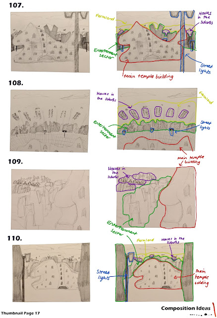
What If Metropolis (Thumbnails (107-110) Possible Compositions
107- I like this composition because I feel like the angle works well due to the street light in the foreground and the positioning of the temple
108- I tried to work out a composition where the whole city was in the shot in some way but I don't like the angle and I don't think the positioning of all of the different 'sectors' are correct
109- I tried to use an alternative angle in this composition but I think this may too be too hard to make the 3D model and matt painting work together seamlessly
110- I like this composition because I used the perspective of as if you are just walking into the centre of Estrella from the entertainment sector


Hey good work!! I really like how you're thinking about composition, that's something I always struggle with. I think 109 is a great thumbnail even if you don't like it as much as the others! 110 is also good - you're right about how it feels like you're walking around in the city, maybe give a few different variations of that one a go :)
ReplyDeleteThanks Chloe! I've actually changed the shape of the main building now so I'm definitely going to do some new compositions like 110! :)
Delete