What If Metropolis Thumbnails 111-127
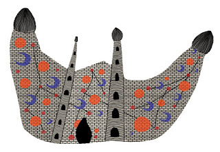
I have decided to change which one of my final temple designs I'm going to use because after receiving feedback I believe this one was stronger out of the three.
Although I did like the pattern design on my original choice but it did look a bit too dark so I have tried to combine the two but still made it so its bright and light.
I spent time removing the background from the pattern as this is what was making it appear dark and dirty. I also lightened the colour that I used as an overall colour
I think that this is the strongest design now, but maybe it could be improved still?
I then started drawing out by some more possible compositions for my concept art
I also tried to work on the main building, by trying to make it look more 3D but i'm not sure how well that turned out (I also included a top view of the building (117)
I then also tried making the houses look more 3D, and I think these were more successful
Some more possible compositions...
I then used Maya to create a very rough model of the city to try and find some more interesting angles. I will definitely be doing more of this as it helped me a lot to be able to visualise my city and find angles that I would have otherwise found too difficult to draw.


Comments
Post a Comment